SOURCE:
You can make any piece of data look bad if you try 🔄 (tker.co)
You can make any piece of data look bad if you try Let's review 9 unsettling market observations that miss the point There’s more than one way to frame a piece of economic or financial market data.
It might be better than expected relative to economists’ expectations, but it could also be worse than expected relative to traders’ expectations.
That same stat could be down on a month over month basis and also up on a year over year basis. It may be high relative to the 10-year average but low relative to the 5-year average. It may look bad on an absolute basis but it may look good relative to what may be the normal course of business.
Consider the recent consumer price index report released on Wednesday. The inflation storyline has plenty of political implications these days, especially with midterm elections right around the corner. Following the report, the White House press secretary tweeted “our economy had 0% inflation in July.“ Critics, many of whom were motivated by the opposite political agenda, took issue with the White House touting the month-over-month figure while the year-over-year figure was 8.5%.
Both figures are accurate. But they each lead people to very different conclusions.
Kyla Scanlon has a great discussion on this in her newsletter (which is absolutely worth subscribing to):
…The thing is (and I think part of the reason people were mad) is when you say that things are getting better, people often interpret that as you saying that things are good.
Those are two different things - good versus getting better.
Velocity and acceleration. Inflation is still high - the car (inflation) is still zooming along, as shown in the first picture of this article - but it’s decelerating. The rate of change in July prices was zero.
There are all sorts of motivations for why someone will choose one framing over another. Maybe it better fits with your political agenda. Maybe it better confirms your priors. Maybe it helps bring clicks to your news site. Maybe it better explains the day’s market moves.
At TKer, we try to focus on the big picture. Specifically, we’re looking to understand what data tells us about the long-term themes that drive the markets and the economy over relatively long investment time horizons.
With that in mind, below are nine unsettling — albeit accurate — market observations that miss the point when you take a look at the big picture.
1. Companies announce layoffs
The reports are accurate. For months, layoffs have been affecting an array of companies, including well known names JPMorgan, Netflix, Tesla, Coinbase, Robinhood, and Peloton. And the numbers are not small. According to the BLS, 1.3 million workers were laid off in June alone. It’s an incredibly challenging situation for everyone impacted.
BUT, this is not yet a sign of a labor market downtown. Those 1.3 million layoffs represents represent about 0.9% of the 152 million employed during the period. Believe it or not, this is an unusually low layoff rate. In fact, the layoff rate has been below pre-pandemic lows for 16 straight months. Some experts even believe employers are actually reluctant to layoff workers despite the ongoing economic slowdown.
Read more about what’s going on with layoffs here and here.
2. Consumers are tapping into savings
The reports are accurate. The personal saving rate is coming down, and consumers are drawing from the more than $2 trillion in estimated excess savings they have accumulated since the start of the pandemic.
BUT, the point of having a rainy day fund is so that you have something for rainy days, and these are rainy days. One of the most bullish aspects of excess savings is consumers have a much bigger financial cushion to fall back on should economic conditions turn against them. With inflation eating away at purchasing power, thank goodness consumers have savings to tap. This is a much better situation than one where consumers have to forego spending on critical goods.
Read more about the savings tailwind here and here.
3. Supply chains are tight
The reports are accurate. There’s evidence that parts of the global supply chain continue to be tight. There’s no question there’s room for improvement.
BUT, supply chains have improved dramatically since their most troubled periods last year. Delivery times have gotten shorter, ocean freight rates have come down sharply, trucking capacity is up, and inventory levels are gradually returning to normal.
Read more about improving supply chains here and here.
4. Debt levels are up, and delinquencies are rising
The reports are accurate. Mortgage debt, credit card debt, and auto loan debt are all up. And delinquencies are rising.
BUT, any serious conversation about debt should also address the capacity to finance that debt. Asset values, cash levels, GDP … all sorts of metrics associated with the capacity to finance debt are way up relative to history. As result, debt payments as a percentage of income are low relative to historical levels.
And while delinquencies are rising, they remain depressed relative to normal historical levels.
Read more about why rising debt has been manageable here and here. Read more about why rising delinquencies aren’t cause for alarm here. Ben Carlson has great discussion on all of this on his blog, A Wealth Of Common Sense.
5. Stocks are in a bear market
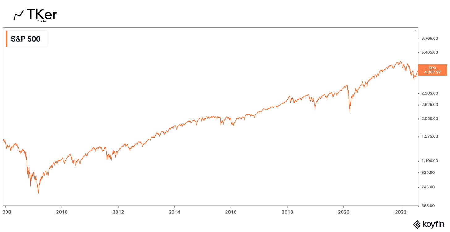
The reports are accurate. From January 3 to June 13, the S&P 500 fell 20%, putting the index into a bear market. And despite recent price gains, we still have a ways to go before we can declare the bear market over.
BUT, unless you made all of your S&P 500 purchases at the very top of the market on January 3, your actual losses aren’t going to be that bad. And if you’ve been purchasing stocks incrementally for a while, you probably still have a considerable gain on your investments.
Read more about market timing here and here. Read more about how bear markets are part of investing here and here.
6. Earnings expectations are getting slashed
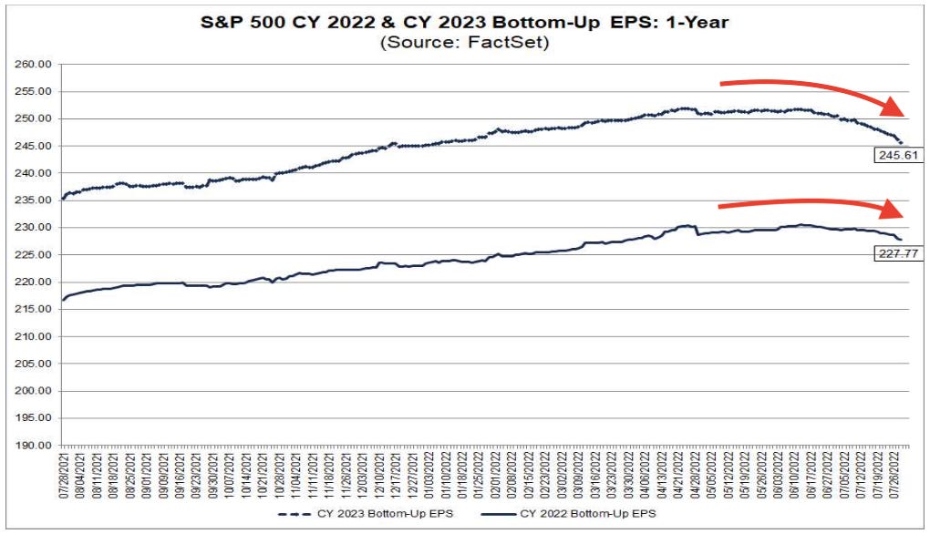
The reports are accurate. Analysts have been lowering their estimates for S&P 500 earnings in 2022 and 2023. Without question, this is a big deal: Earnings are the most important long-term driver of stock prices.
BUT, analysts are still projecting high-single-digit earnings growth for this year and next. And with stock prices already down sharply this year, the bad news of lowered earnings estimates appears to be priced in.
Read more about lowered expectations being priced in here and here.
7. Recession odds are rising
The reports are accurate. The odds of a recession in the coming months have gone up. Indeed, the Federal Reserve is actively trying to slow growth. And economic data confirms that growth has slowed dramatically.
BUT, not all recessions are created equal. The slowdown — and possible recession — we’re facing is not the result of consumer and business excesses run amok. Consumers and businesses have been pretty disciplined with their finances. This could mean any recession could be shallow and short-lived — and one in which unemployment goes from very low levels to just sorta-low levels.
Read more about recession risks here and here.
8. Mortgage rates are their highest in years
The reports are accurate. Mortgage rates have risen to levels last seen during the global financial crisis. This is a problem for prospective homebuyers who are already facing record-high home prices and may now have to wait months, if not years, to buy.
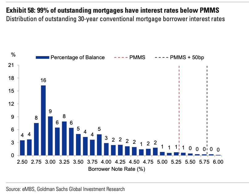
BUT, rising mortgage rates are exactly what the Fed wants as it aims to cool the economy in its effort to bring down inflation. Also, this is not a sign we’re about to enter another financial crisis. According to Goldman Sachs, only 3% of mortgaged properties have negative equity and 99% of outstanding mortgages have a locked-in rate that’s lower than the current market rate (PMMS).
Finally, adjustable rate mortgages are nowhere near as popular as they were during the housing bubble, which means very few mortgage holders are vulnerable to the rising mortgage rates that can come with them.
Read more about the cooling housing market here.
9. Energy costs are up
The reports are accurate. While energy costs may have ticked lower over the past month, they are still way up from a year ago.
BUT, everything that requires energy continues to become more efficient, meaning energy cost spikes today don’t have the same kind of impact they did years ago. The average car currently gets about 25 miles per gallon (MPG), up from about 13 MPG in 1975. More broadly, spending on energy as a share of total personal spending has been trending lower for decades.
Read more about the impact of higher energy prices here.
When you zoom out, things look pretty bullish
When you’re in the moment and looking at data over very short periods of time, it’s easy to become discouraged. After all, anything and everything could always be better. And to be fair, there’s always a risk that things do get much worse.
But when you zoom out a bit, you’ll see that a lot of things have been improving in the long run. Whether it’s financial health, energy efficiency, lending discipline, or general economic conditions, most have gotten better over time.
For investors, all this helps to explain why earnings have trended higher over time. And since earnings are the most important driver of stock prices, it also helps to explain why the stock market usually goes up.


No comments:
Post a Comment
Note: Only a member of this blog may post a comment.